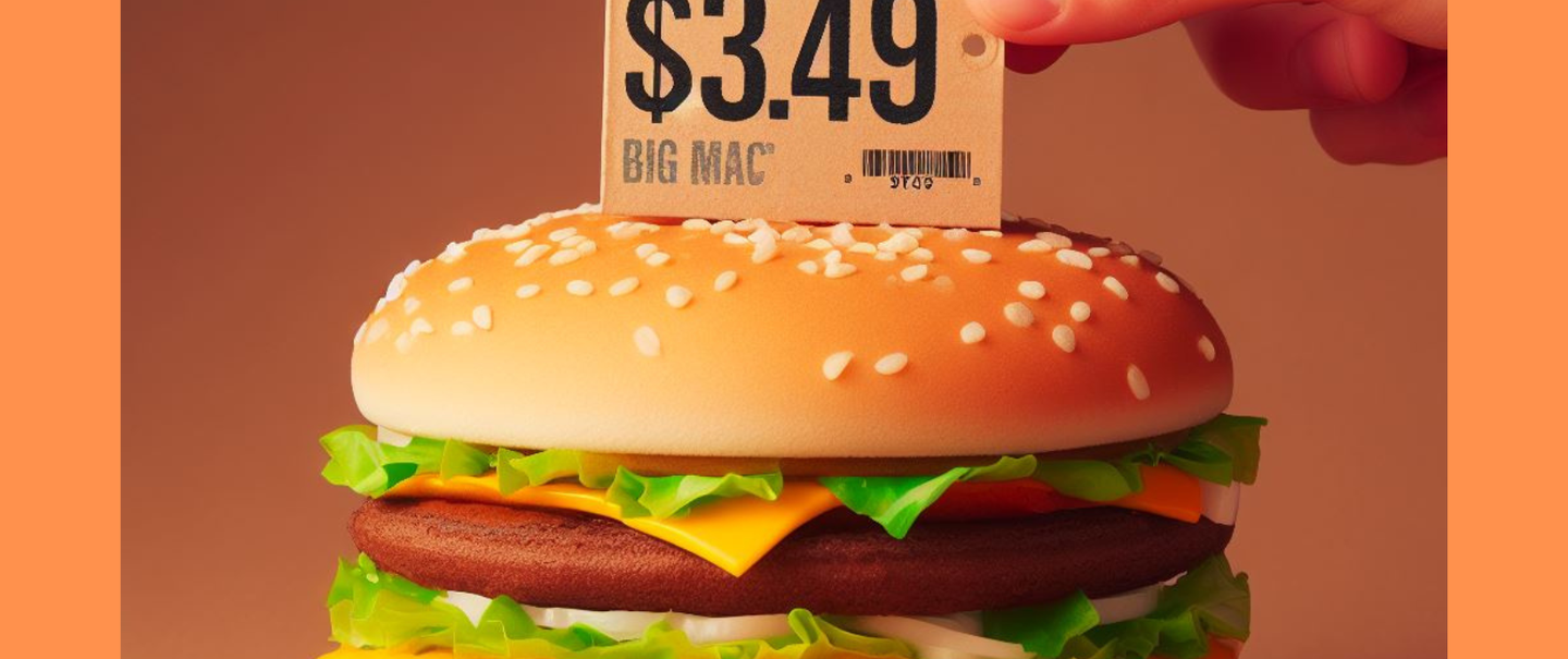
The McCheapest Map is an appropriately named tool that tracks the price of Big Macs at every McDonald's location across the U.S. using a conveniently color-coded map. Colored dots identify locations serving up cheaper (shades of green) and more expensive (shades of red) burgers. The interactive map allows you to move around the map and the cheapest and most expensive Big Mac in the selected area will display in the upper left corner.
So, now you can hop in your private jet and fly to whichever Mickey D's is touting the lowest price, right? Yeah, no. This is really just a tool for people with curious minds who want to see how their local McDonald's stacks up against the rest of the country.
The McCheapest Map was created by U.K.-based commercial analyst Sacha Fournier and now lives on the food advice and research site Pantry and Larder.


